Corné Voorwinden
Design Systems
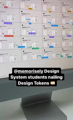
To become an expert in the field of design systems I did a bootcamp with Memorisely. During this bootcamp each week there was a group lessons and a co- working session.
The first question is: what is a design system exactly?
According to Nielsen Norman Group: A design system is a set of standards to manage design at scale by reducing redundancy while creating a shared language and visual consistency across different pages and channels.
Think of them as a form of living document, detailing the fundamental styles and components of a product, as well as the when and how they should be used.


Daily Harvest design system
This design systems is created for Daily harvest. During the Memorisely design systems bootcamp the goal was to create a design system for an app or a website that you find interesting. The design system contains the foundations and a few components to illustrate how the design system can be implemented. In the future i can add patterns to the design system to improve it even more.
Foundations
In terms of Design Interface, some people might follow the “Atomic Design theory by Brad Frost” where an atom is the most basic, abstract element and not so useful by itself, it depends on the need we have to build a product the atom will evolve into molecules, organism, etc.
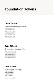
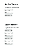
Design tokens represent the small, repeated design decisions that make up a design system's visual style. Tokens replace static values, such as hex codes for color, with self-explanatory names.
Color
In the design system I differentiated different roles for different colours.
Base: Base colours are used for interactive components.
Neutral: Used for basic elements likes body, headings etc. But they are also used to create surface colours borders and other neutral components.
Feedback colours: Destructive, Succes, Warning and Info.
Accent colors are used to give feedback to users. They are temproary colors in our interface that help guide users as they interact
Type
When defining our type system, it’s important to follow the 4px rule when working with text. This ensures our type is evenly spaced.
The different kinds of type included in this design system are Headings, Body and Button type.
Spacing
The value of our 4px spacing system is it makes it effortless to design and build consistently. IF everything is a multiple of 4 then we can eaisly strive for harmony in our design and development.
Important is that it starts with the content and the padding follows the content.
Components
Some of Figma’s most powerful features are components and styles. They allow us to reuse design elements, and object attributes across multiple files, and throughout organisations.
Lists
One of the important components on a website or in an app is a list.
In Figma I recreated the lists from Daily Harvest. In the design system I looked at: Examples, Atonomy, Variants and Usage
Cards
One of the important components on a website or in an app is a cards.
In Figma I recreated the cards from Daily Harvest. In the design system I looked at: Examples, Atonomy, Variants and Usage
Future steps
In the future i want to implement patterns into this design system and want to create more design systems of different websites and apps.